Valentino Campaign Advertisement
FORM:
Hue(s) seen = red, yellow, green, black
Value(s) seen = high contrast between the dark negative space/shadows and light subjects.
Intensity seen = The red in the image is the brightest, most intense, closest to a pure hue. The green of the dress is deintensified with tinting and toning. The greens in the left image are deintensified with shading. There are also some more neutral shades in the left display (gray, tinted red, tinted yellow).
Temperature(s) seen = Overall the colors in the ad have a cool temperature, with exceptions for warm tones in small details in the left display such as the flowers, and fish.
CONTENT: The low key value in the background of this ad creates a sense of mystery and isolation, as the viewer does not know what could be in the dark though it appears empty. The dark also helps emphasize the subjects of the image through contrast, forcing the viewer to see only what they're wanted to see: the luxury items displayed like a renaissance painting, and the dress inspired by that lifestyle. The use of bright and deep red conveys a sense of romance seen in the renaissance era.
Another way that color benefits the composition of the piece is how complementary colors are used (red and green) in the design of the dress and left display, yet the green has been deintensified to lower the contrast. This allows a softer, more feminine approach that corresponds with the scalloped edges on the dress and flowers in the display, which again relates to the theme of modern luxury and romance.
Source: http://www.casasugar.com/Valentino-Fall-2013-Ad-Campaign-31082622
Using COLOR THEORY Vocabulary ART102 Sec. E
A series of required student blog postings incorporating the language of color. Students relate color vocabulary to imagery from their respective majors.
Wednesday, January 28, 2015
Wednesday, January 22, 2014
EXAMPLE: ART102E - Media Arts & Animation : Additive Color Mixing
 Additive Color Mixing
FORM:
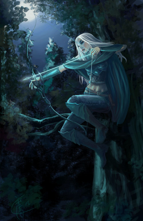
This picture was created by an artist using drawing software on a computer, therefore the picture contains Additive Color Mixing. The picture uses Additive Color Mixing because the photo was created entirely on a computer and computers mix light to create colors/images. When Additive Color Mixing happens, the artist can then select different shades/colors of 'ink'/ mixed light to paint their picture.
IMG Source: Here
Tuesday, January 21, 2014
EXAMPLE: ART102 E - Fashion Marketing - PROCESS COLOR MIXING
FORM:
The photo used on the cover of W Magazine is printed in CMYK. The CMYK color model is processed color; maintaining four different types of color: Cyan, magnet, yellow and key (black).
Image Source: models.com
The photo used on the cover of W Magazine is printed in CMYK. The CMYK color model is processed color; maintaining four different types of color: Cyan, magnet, yellow and key (black).
Image Source: models.com
Monday, January 20, 2014
EXAMPLE: ART102E - Apparel Design - Subtractive Mixing
Form: The cover photo for Vogue is printed using subtractive mixing, more specifically a CMYK color model. Cyan, magenta, yellow, and key black inks are printed in layers on white paper in order to create the desired colors for the photograph and words. For example, "VOGUE" is seen as red, which is caused by the subtractive color mixing process of layering magenta and yellow ink.
Source: http://vogue.tumblr.com/post/73444834867/lena-dunhams-first-vogue-cover-on-newsstands
Source: http://vogue.tumblr.com/post/73444834867/lena-dunhams-first-vogue-cover-on-newsstands
Subscribe to:
Posts (Atom)


